Connecting Georgia's Vibrant Capital

TRAVEL Tbilisi

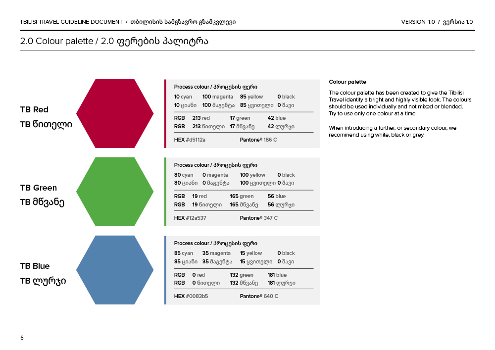
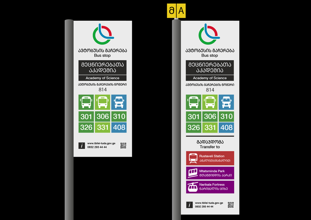
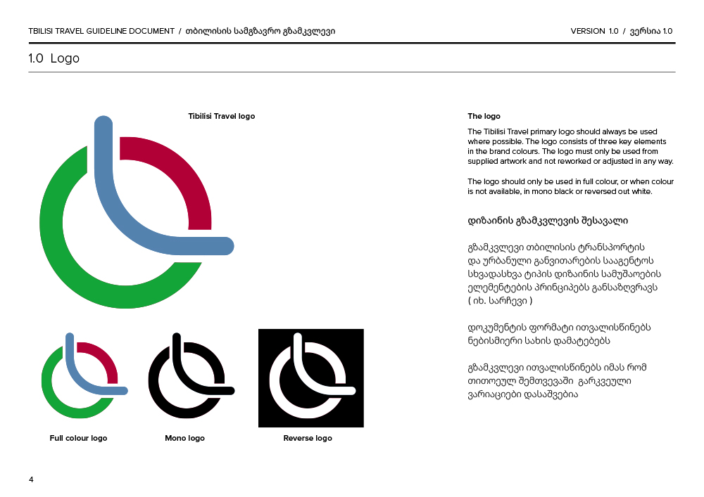
Working as designers for a information consultancy firm, we produced the information design concepts for Travel Tbilisi, the executive operating transport across Georgia’s capital. Delivering guidelines for the overarching identity including: logotype, signage, colourways, mode iconography and typography.

Connecting travel across Tbilisi

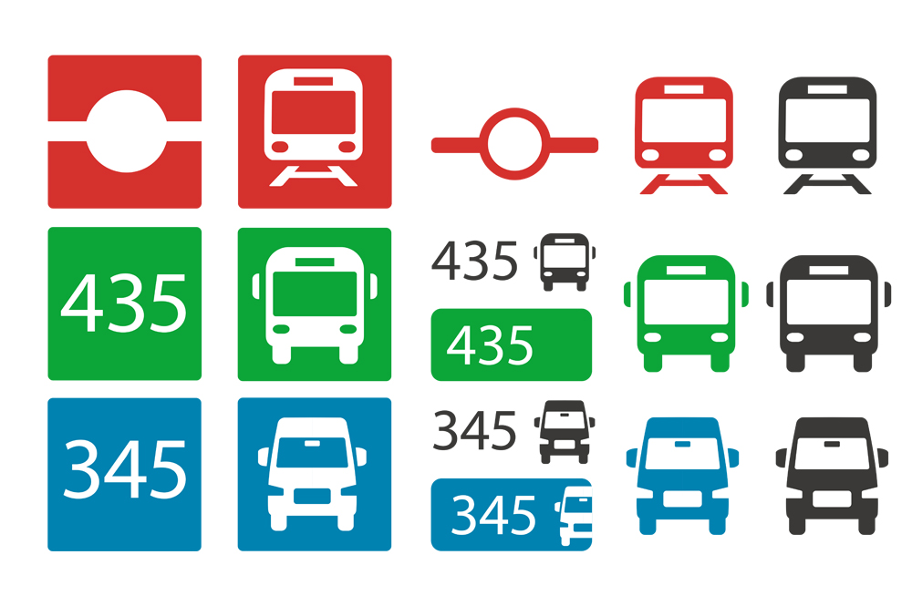
Over time, the existing transport modes (Metro, Bus, Minibus) had developed separate identities that didn’t quite connect with each other. Although there was a colour system for the different modes, it wasn’t consistently applied—different shades of red were used across the Metro network, and bus services had varied operator identities. To create a more unified experience for passengers, we decided to align the visual identities for Metro, Bus, and Minibus. This involved defining clear icons and consistent colour schemes, ensuring that passengers would enjoy a seamless experience across the city, whether they’re using bus stop information, metro maps, or local minibus services.
 
The redesigned color schemes also played a key role in shaping the new, cohesive network identity. This fresh look reflects the city’s unique shape, featuring a blue dividing line that runs from north to east, symbolising the River Kura flowing through the heart of Tbilisi.
 
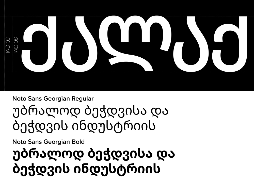
An important part of the design process was considering the complexity and length of the Georgian language. We needed to choose a font that offered clarity and could comfortably display the long, historic city names in Georgian, often alongside English translations.
 
Information Design Services:
  • Information audit
  • Brand identity
  • Mode design / colourway
  • Infographics, pictograms and icons
  • Street furniture information design
  • Guideline production
  • Supply of artworked assets


The Demographik team were keen to get their sleeves rolled up and out on our network to get a clear view of the customer experience and the reality of traveling in the UK by coach. This attention to detail along with a collaborative, supportive style made them a pleasure to work with and I’d be happy to recommend them for similar projects.
Jeremy Booker

Marketing Manager, Communications, National Express

BAA

BAA

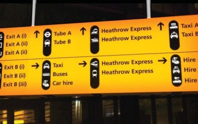
BAA Heathrow commissioned Demographik to design a suite of pictograms to be used in the airport, to direct people from all around the world to the right place. Creating a simplistic and unified system only comes through working through a detailed process.

read more
Information Design Overview

Information Design Overview

From a complete audit of national transport networks to rethinking and designing single mode icons, we make information accessible. Across the UK, by rail, bus, tram and on foot, we aim to help passengers get to where they want to be.

read more

Say Hello…


Want to find out more? Then get in touch with Sandy. Click here to send her an email or call 0207 843 6959